
I believe that data tells a story, just like words and images do. The tricky part with data is to figure out what story it is trying to tell, and to then convey that to others visually.
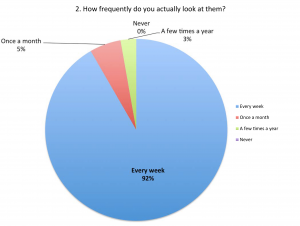
This data, below, tells a story about a synagogue that has weekly, e-mailed announcements. This page says that the announcements are frequently accessed. The other pages tell other stories about it. Collecting, aggregating, and analyzing data is essential to so many of the decisions that all groups need to make–be they public institutions, corporations, or even groups of friends making joint decisions.
Click on the image above to see a PDF of the full report.
Below is another kind of data that tells a different kind of story.
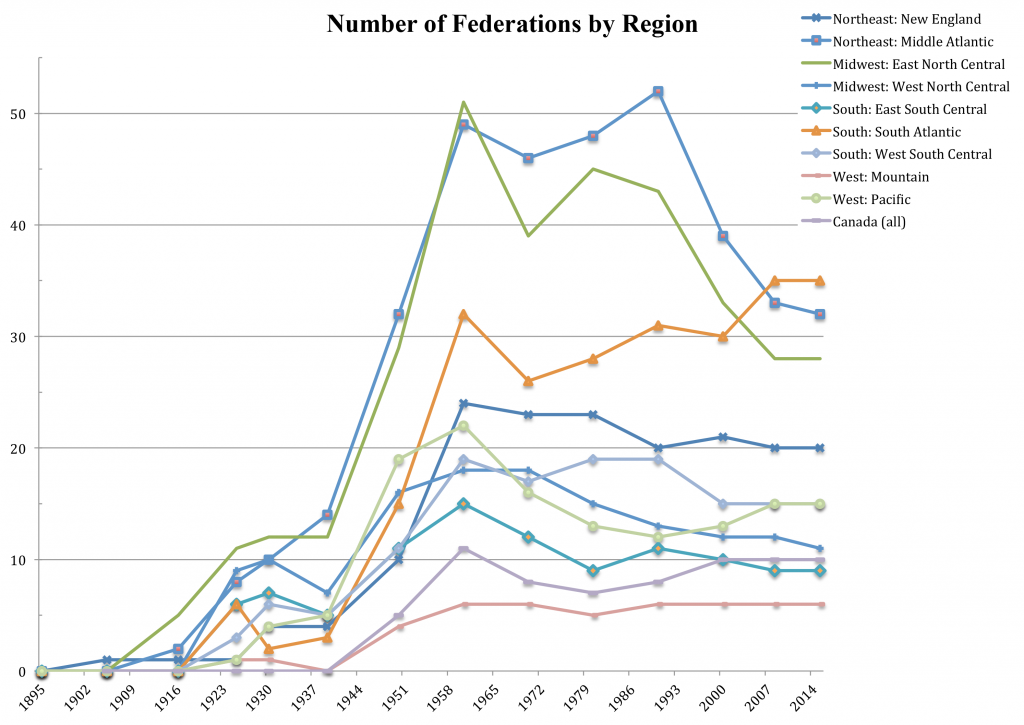
This data does not capture a snapshot in time, like the synagogue announcement data above does, but it tells a story of trends over a long period of time: more than a century, in some cases! The page displayed below tells a geographic story: Where did Jews move over time? Where did they set up federations? When and where did federations consolidate or close or both? Where did small Jewish communities become larger?
Click on the image above to see a PDF containing several different thesis appendices that tell different stories.
Other pages in this PDF (a selection of appendices from my masters thesis) tell different stories. One tells a story of upward growth of annual campaigns, followed by a plateau. Another, where the value of money is held constant over time, tells a story of repeated ups and downs, followed by a more recent decline in annual campaign size. A third tells a story of continued growth in endowment sizes over time.